Building a jump rope app with the modern data stack
TLDR: I like to jump rope throughout winter, but felt there weren’t any apps that let me analyze my data the way I wanted to. Recently, Izzy from Hex built me an iPhone app that records raw gyroscope and accelerometer events and uploads the data to GCS. Once in GCS, I was able to query the data in BigQuery (later in Snowflake), explore it in Hex (analysis I, analysis II), transform it in dbt (source code, project docs), and build a performance tracking app (also in Hex).
This article talks through the process I used to build this stack, and includes callouts to discuss how this project is similar (and dissimilar) to professional analytics projects.
Why I care about jump rope data
Last November, I moved to Vermont, and to a new apartment. My upstairs neighbor, a med student, was at home full-time for remote learning. As a way to break up his lessons, he would jump rope for 10-20 minutes in the driveway once or twice a day.
I hadn’t jumped rope for years, and something about it called to me. As the temperatures became increasingly hostile (and not feeling comfortable heading to a gym before I was vaccinated), I decided to give it a go too.
At first, I was terrible, barely making it a few dozen jumps before running out of breath. Over time, I got fitter, and my form improved, meaning I could jump for longer using less energy. Although I could tell this was happening, I wanted to see numbers that would back it up. When it came to recording my jump rope workouts, I had two options:
- Measure my duration using the Apple Fitness app on my watch
- Use a pedometer app to record the number of jumps.
With these two tools I could answer whether I could jump rope for longer, by checking my workout length and number of jumps.
But I didn’t feel these gave me the full picture. I wanted more numbers! For context: a few years ago I was deep into cycling, and became used to using apps like Strava and TraningPeaks to analyze every metric you could possibly want — Functional Threshold Power, Intensity Factor, and Aerobic Decoupling (these are all legit metrics, I promise!).
Where was the tracking app for jump rope though? How could I quickly compare my duration over time? And how could I answer new questions like:
- Am I getting faster? → Jumps per minute
- Is my form improving? → Number of jumps in a row before tripping (a “jump streak”)
- Am I recovering more quickly? → Breaks between streaks
- Am I getting fitter? → Jumps vs heart rate
I thought it would be cool to build something that would help me measure my jump rope performance, but had no idea where to get started — do I create an iPhone app? An Apple Watch app? Do I need to learn Swift, Javascript, React, HTML, CSS? Do I outsource the app building to someone else?
So for months, it stayed in the back of my head as a Potentially Cool Project To Maybe Do One Day™ .
Jump rope vs. YourCo: Understanding the why
(I’ll use these callouts to demonstrate where something is similar or different to a professional analytics projects)I took on this project because I thought it was fun! But when taking on professional projects, you should understand the impact that you want to drive by working on the project, the business decisions it will inform, the why.
Jump rope vs. YourCo: Translating real world questions to data questions
Trying to answer whether I’m getting better at jumping rope is a subjective concept, so I broke it into more objective signals, like whether I was getting faster, and whether my form was improving. Then, I mapped those signals to measurable data questions: like jump cadence, and consecutive jumps.This is a really valuable skill to have as an analyst — can you look at a subjective concept in the real world, and figure out what data questions will help us understand whether things are improving or not?
A very thoughtful gift
Over summer, I met Izzy, the community manager at Hex. Somehow we got chatting about this, and it turns out he has experience building an iPhone app! I mentioned that one day I’d love to start this project, but wasn’t sure how.
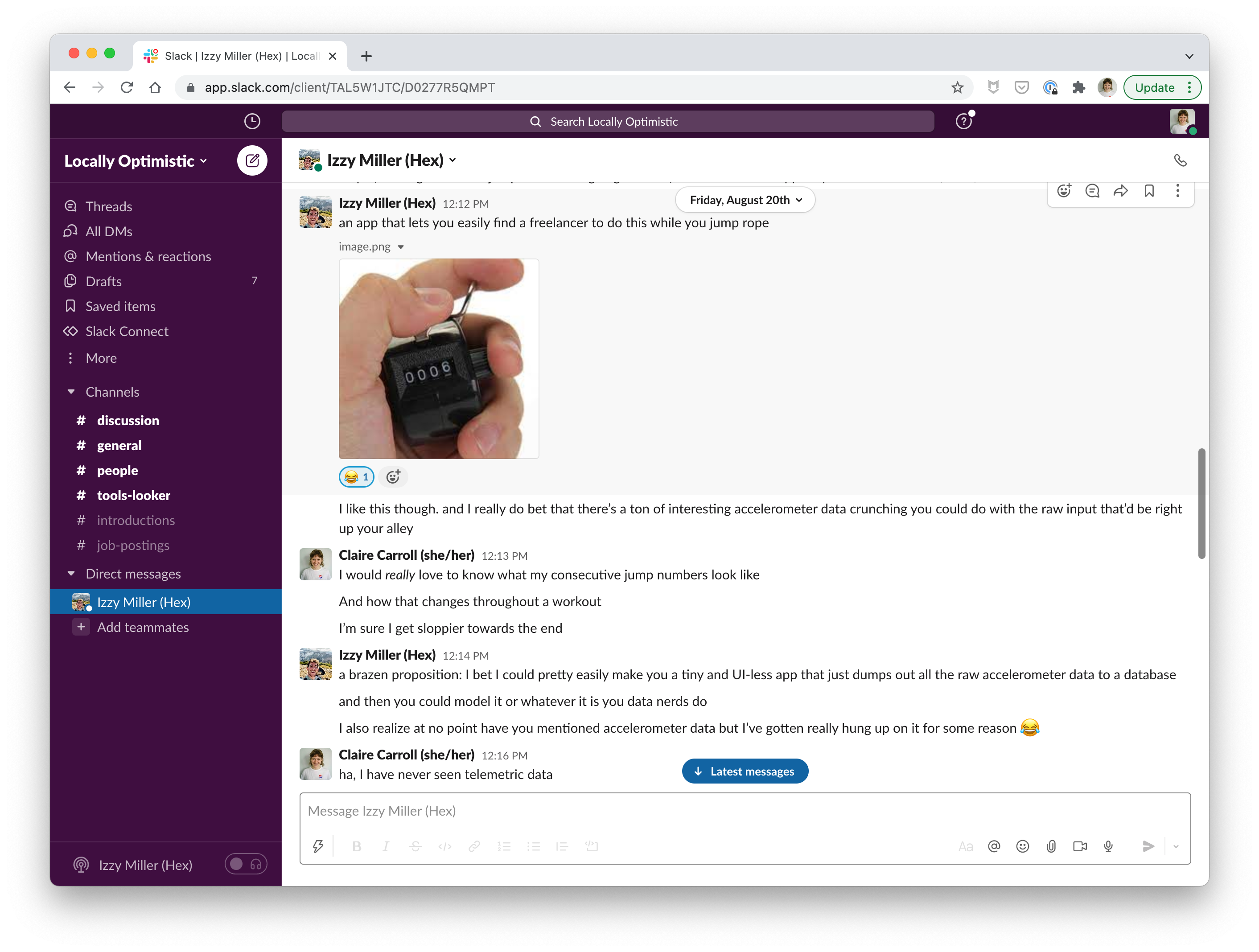
Then in September, we caught up again. At Izzy’s request, I tapped my phone near his hand, an embedded NFC chip lit up, and my phone displayed a popup notification to download an app. Turns out, he’d built me an iPhone app that records raw accelerometer and gyroscope data, and uploads it to a GCS bucket. Once in GCS, I would be able to send the data to BigQuery, and analyze it – something that’s much more in my wheelhouse than building an app that would do the analysis for me!
A huge, heartfelt, thank you to Izzy for doing this — this is probably one of the most thoughtful gifts anyone has ever given me!
Building my jump rope app
So now that I had the data, how do I go from the raw data to being able to answer my questions about my performance? It’s time to build 🛠️.
Getting to know my source data
First up, getting to know what data I had to play with (and whether it could answer my questions or not!)
I did a workout where I wrote a manual log of my jumps so that I could compare the real world with the data that I was generating, to see if I could make sense of it.
I did this exploratory analysis in Hex — at first I started using the tool as a thank you to Izzy (he made me an iPhone app, of course I’m going to use software made by the company he works at!), but as I used it more and more, I fell in love with the tool.
I’ve never been much of a notebook person — I’m a SQL-first analyst (please no pandas group by), I hate fussing to get notebooks running locally, and I’ve been burned by notebooks that have terrible state issues. Hex completely changed my mind on my “not a notebook person” stance, by making SQL a first-class citizen of a notebook (via store connections, inbuilt schema browsers, and dataframe SQL), solving the deployment problem (it’s a web app!), and building some very impressive reactivity features.
Their CEO (and, disclaimer, my good friend) Barry, will be mad at me for saying Hex is a very good notebook, so I’ll set the record straight before I get in trouble: Hex provides a notebook-like interface for writing data logic, but it’s more than that: it also provides a way to publish the outputs as data apps, and collaborate with peers. Some of this functionality will become clear through the rest of this article, but you can also just try Hex out for yourself!
ANYWAY, enough promo. You can see my first exploratory data analysis here:
It turned out that the source data I had was really confusing to make sense of:
- The app was logging accelerometer and gyroscope data approximately every 100 milliseconds (i.e. 10Hz). To make sense of it, I had to identify peaks in the accelerometer data in the “up” direction, and count these peaks as jumps, all in SQL. Yikes.
- It turned out that in order to calculate “up”, I needed to record orientation values (yaw, pitch, and roll (???)) to calculate the up vector and use it in a dot product to calculate true acceleration (don’t worry if you didn’t get that — the point is that things were getting complicated!)
- I managed to do this, but ended up with numbers that weren’t close enough to reality when I validated them against my manual log.
- I also quickly learned that the app didn’t record data when my phone was locked — given I need my hands to hold the jump rope, my phone was stashed in my pocket and it was pretty hard to check if it was unlocked.
- I didn’t have any heart rate data, so I chose to drop it from the scope.
Now that I was starting to wrap my head around the data (and reteach myself college-level physics), I took a step back and let my engineering team (Izzy) know about these issues so we could come up with a new plan. While I waited for a reply, I looked at other solutions, and found an alternate route forward.
I was able to use an app called SensorLog to observe and record all the measurements from all the sensors on my iPhone. Once recorded, I could share the output (JSON or CSV files) via AirDrop. The app records events when my phone is locked (but only when I tell it to), and it let me record data from an Apple Watch too, which was a huge bonus since I typically just wear my watch when jumping.
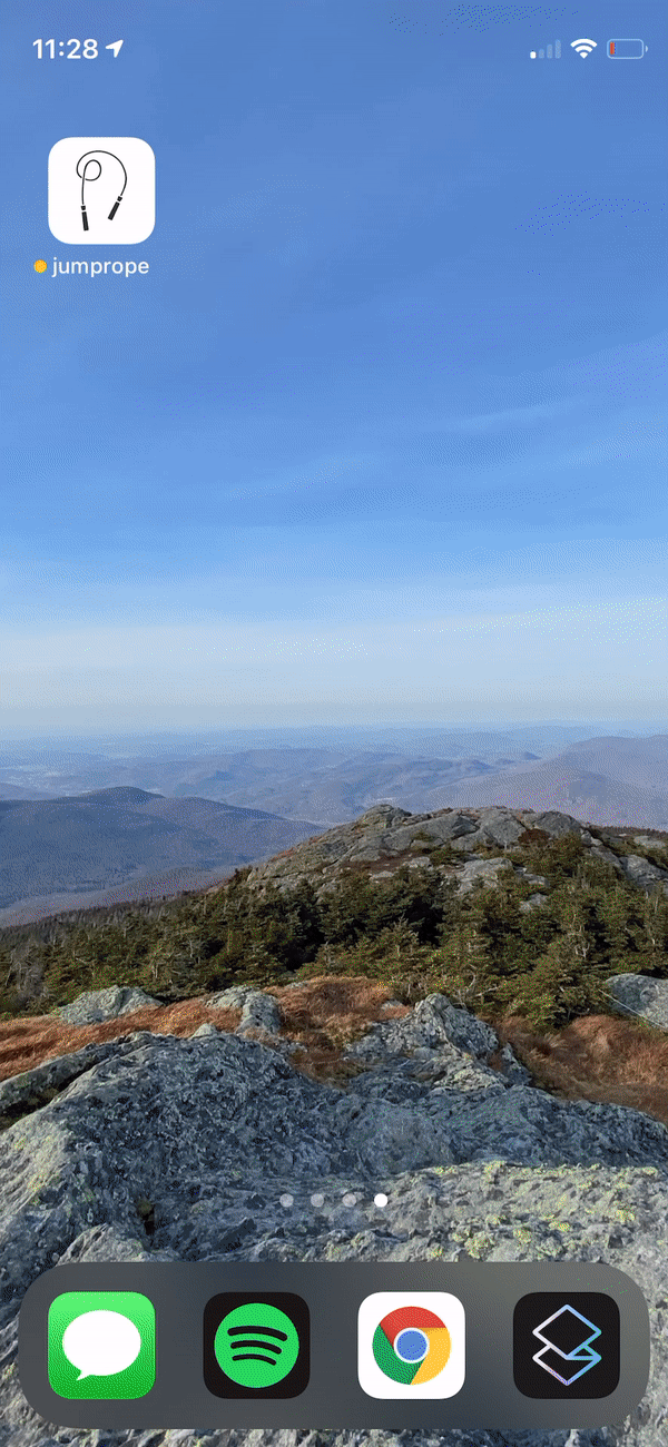
Sure I didn’t get to use “Claire’s super cool jump rope app” (picture above), but truly, it was the thought that counted when it came to that app, and that got this ball rolling. So thank you again Izzy! 🙏
Getting to know my source data: take two
So, it was time to go back outside with the jump rope and some new recording methods. This time, I just uploaded the CSVs directly to Hex rather than to a data warehouse.
At first, I thought I was going to stick with my idea to use accelerometer data to detect jumps, but as I explored the data available to me, I saw a much easier option — the pedometer measures steps every 2.5 seconds. This wasn’t as granular as accelerometer data (I couldn’t see the individual jumps), but far easier to analyze with a simple heuristic like “if my cadence is more than 2 steps per second, assume I’m jumping”.
Overall, I felt like my results were good enough to move forward.
At this point I also decided to make the switch from BigQuery to Snowflake. As much as I wanted to keep this in BigQuery (so that I could publish the datasets for anyone to query, I needed to use a lot of window functions on this data, often chaining columns on top of these functions. BigQuery’s lack of lateral column aliasing made this incredibly frustrating, so, I just called it and switched back to Snowflake. I’ll try to figure out a way to publish the data another time. (Holler at me if you want access to the data and I’ll see what I can do!)
Jump rope vs. YourCo: Exploratory data analysis
It’s important to get your hands dirty and check whether you can actually build the thing you’ve scoped out! In this phase, try to build the minimum viable version of the final artifact, taking shortcuts, and getting to know your datasets along the way.Use a notebook interface (obviously I recommend Hex) to group all this work up into one coherent piece, craft a narrative around the queries you’re writing, leave notes for yourself and stakeholders, and ask for comments.
Some important skills in this phase include:
Validating results against other sources
In this project, I used a written log to check if my data results matched reality. You should be doing this as an analyst too — whenever you work on something new, figure out if you have other sources of information to tell you whether you’ve calculated things correctly. This might be the reporting from another app, qualitative feedback from a CS team, or checking against a spreadsheet that someone has been meticulously hand-maintaining.Breaking the problem into smaller pieces
Many times through this project, I broke things into smaller pieces — I didn’t build my data ingestion pipeline at first, and instead queried a CSV directly. I analyzed one workout, before trying to analyze many. I used pedometer data, instead of raw accelerometer data. Analytics projects are complex — learning how to break them into small pieces and solving each piece at a time is a valuable skill.Working to improve your data quality
As members of data teams, I think too often we accept thelovedata we think we deserve. In professional projects, I tend to work with engineers to understand how the data is being generated, and whether we can improve the collection process and thereby the quality (here, I cheated by switching to a different app).Communicating with your stakeholder
I was my own stakeholder here, but usually during this process I’d work with my stakeholders to make sure the thing I am building is what they expect! (FWIW: Hex’s commenting ability makes this incredibly easy)
Mocking out a dashboard and data models
At the same time that I was getting to know my source data, I wrote out a quick mockup of the final thing I wanted to build — this technique provides a really concrete way of understanding what you want to build, and can prevent you from going down rabbit holes that don’t ultimately deliver value.
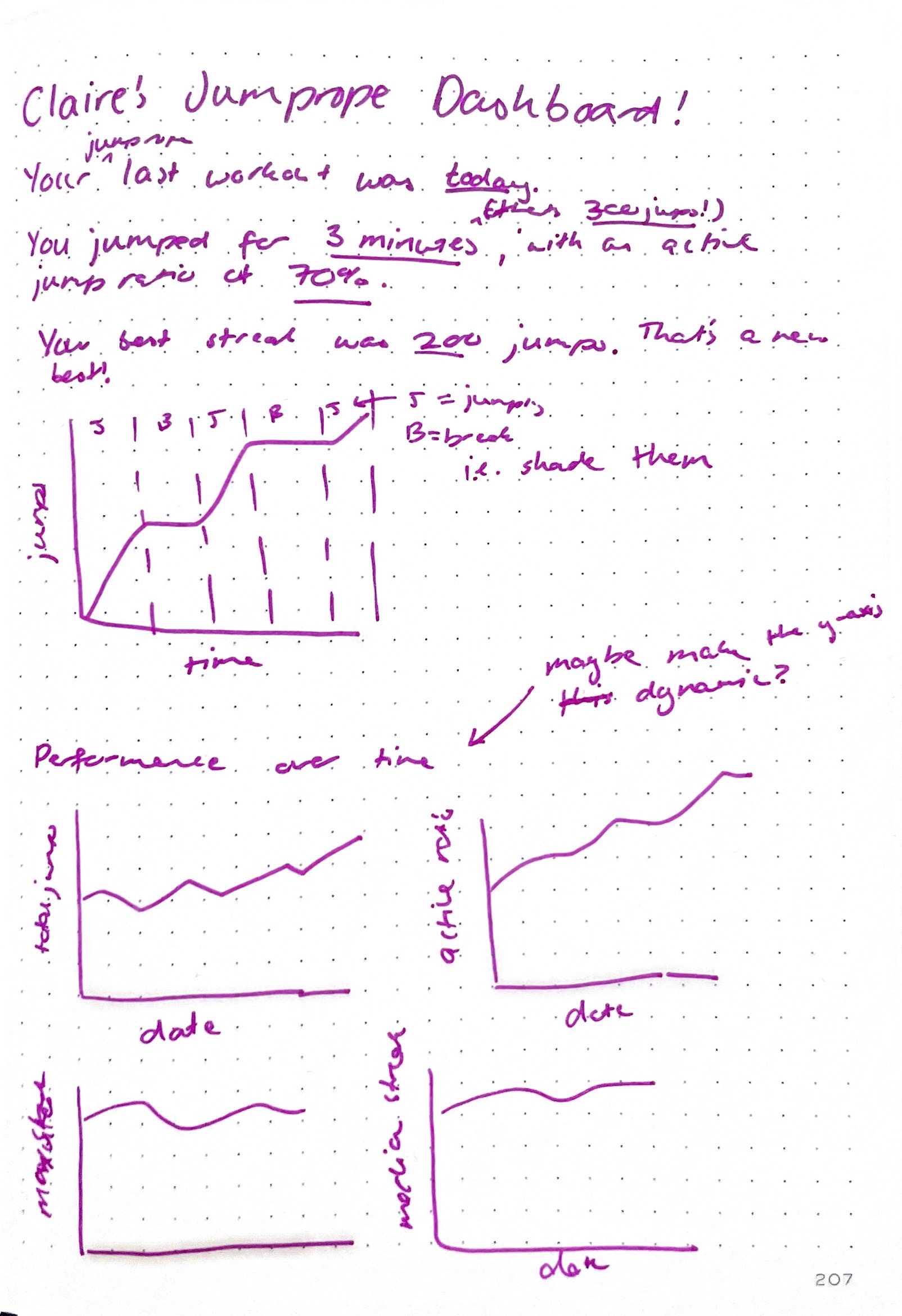
I also tend to try to think about naming and the grain of my models around this same time, as well as some of the columns I would need on them. I knew I would broadly have some models like the following (these are toggles — expand them to peep some column definitions)
workouts(orsessions?): one record for every time I pick up my jump rope and head outside to jump. Fields include- start at
- end at
- duration
- number of jumps
- longest unbroken jump streak
- average/median jumps per streak
- jumping time vs break time (a ratio of the two?)
- cadence?
jump_streaks: an unbroken set of jumps (i.e if I trip on the rope or get tired and stop, the streak ends). Or “consecutive” jumps?- start at
- end at
- duration
- number of jumps
- cadence
- position within workout
breaks: any time between streaks- start at
- end at
- duration
pedometer_measurements: The measurements I was recording were a time series, which is actually a dataset structure I haven’t worked with a lot myself! Most of the fields on this came from the raw logs themselves.
Jump rope vs. YourCo: Mocking out dashboards and models
If you’re a dedicated reader of mine (lol), you might recognize that mocking out dashboards, defining the grain in terms of real world actions, and jotting down expected columns are all standard parts of my process. On more complex projects, I’ll often also write pseudo-SQL and sketch out my dbt DAG.
Moving the data transformations upstream
Now that I had queries in my exploratory data analysis with some promising results, it was time to move the heavy-lifting of data transformations upstream.
To do this, I had to actually get my data into a warehouse — for now, I’m using a stage to copy data from S3 into Snowflake. There’s a lot of different ways to move data from external storage into your warehouse — I won’t sweat the details here.
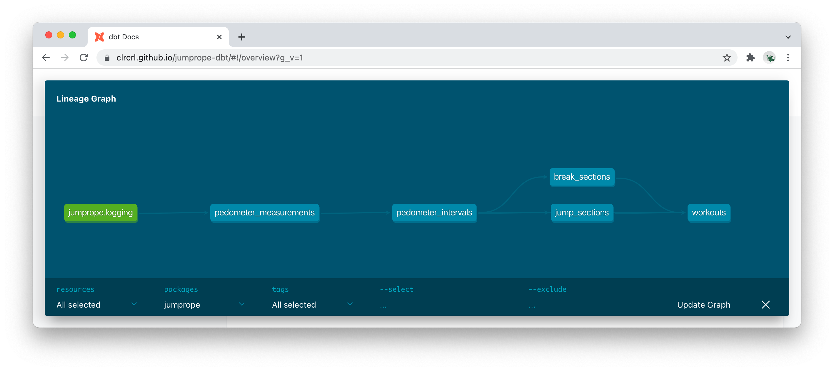
Once the data was in Snowflake, I spun up a new dbt project, moved the transformation logic into said project, and added some light docs and testing.
You’ll see that some of the naming changed from my original definitions, and very keen readers will notice that my SQL is slightly different to what was in the exploratory analysis — it’s totally normal to iterate on naming and code while moving things into dbt.
You can find the source code here, and project docs here.
Jump rope vs. YourCo: Moving data transformations upstream
I usually follow the process outlined here: explore first, then turn into transformations. At times, I’ll parallelize these tasks if I feel like I’m directionally correct with the queries I’m writing, or if I’m working with some JSON data where it’s easier to clean it up first than to try to work with it in its raw form.It’s worth noting: the project outlined above is much simpler than every professional project I’ve worked on — I had one table, feeding a handful of different models. I didn’t use any subdirectories to organize my project, nor did I use the standard naming conventions. Usually professional projects have hundreds of models, so there’s a different set of tradeoffs to take into account in terms of organizing your project and naming things.
Building a proof of concept app
Now, the final piece: making my app! This part was easy because we’ve already done all the hard work! It probably accounted for 10% of the project.
You know what, it’s easier just to show you the finished thing 🙃
Jump rope vs. YourCo: Building your final app
Building the app (or dashboard) you plan to deliver to your stakeholders is the “tip of the iceberg” when doing analytics work: it’s the stuff that people see, without realizing how much work went into getting to that point.Just like in this hobby project, in professional projects this final step should feel easy because you’ve already done all the hard work — if you find yourself putting in a ton of work to build this final app, chances are you didn’t dive deep enough when doing exploratory data analysis (you did do that, right?) and modeling your data (you also did that too, right?!). The exception is if you’re using custom visualizations: that can add extra effort to this step.
Go jump some more!
Now that I’ve built my dashboard, I need to do some more jump rope workouts to see how useful it is — chances are, over time I’ll iterate on the final app more to perfect it. I might also integrate heart rate data since I was able to get an advanced copy of the next release which records the heart rate measurements from my watch.
Jump rope vs. YourCo: Iterating on your solution
Like any greenfield project, you won’t write your code perfectly the first time. A column that you thought was a good name (likenumber_of_steps) will be mildly annoying later (“shouldn’t that benumber_of_jumps?”).You’ll realize you’re missing columns that would make your life easier, or didn’t quite get some logic right (e.g. starting my workout when I start jumping, instead of when I hit start on my watch).
You’ll think of new data visualizations you hadn’t thought of before, and want to add them in.
This is all part of the process.
The final architecture
So what did I end up building? A pretty typical modern data stack:
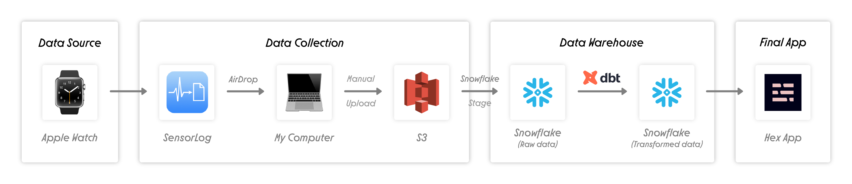
- Data collection via SensorLog, which I then AirDrop to my laptop, and manually upload to S3 via the AWS console.
- Future upgrade: This app has the functionality to send data to an API. I decided not to go down this route, since it felt like extra complexity for this project that I didn’t need. I hope it goes without saying that you should not be relying on airdropping a file as a pipeline at your company.
- Future upgrade: The next version of the app tracks heart rate, opening up a whole new path for analysis
- Data ingested from S3 to Snowflake via a stage
- Future upgrade: more robust way of doing this to handle possible schema changes, e.g. Fivetran
- Data transformed via dbt (source code, project docs)
- Scheduled via dbt Cloud daily but I kept everything as views so as soon as the data hits Snowflake, I see it in my dashboard. Real time analytics, baby!
- Hex app reporting on my workout
- I manually click the “run” button, and then feel good about myself for having worked out

Final thoughts
I set out to find out whether I was getting better at jump rope, but haven’t answered it just yet — as the temperatures are once again dropping in Vermont, I’ve been picking up my jump rope more often, but I’ll need a few more weeks of data to find out.
But I also wrote this to encourage you, dear reader, to take on a hobby data project of your own — find some data on your hobbies, passions, or persistent shower thoughts, on r/datasets, or data.gov, write your own app, or build your own spreadsheets, and get building! And tag me on the bird site when you show off your work!